Before I could class my Women's poster as being 'finished', I decided that there was a few small changes to be made. The poster was always intended to be simple, with very little text, however, I felt that the poster did no give enough information. To rectify this, I added a small paragraph to the bottom left of the poster, with a pithy statistic, just to reinforce the nature of the product.
Another issue was that of the amount of fonts. Each of the pink cirlces above represent a section of text, and in my poster I had a different font for each of these. I felth that this was too much variation and that the lack of consitency was almost off-putting. Therefore I changed all fonts except the 'title' (condoms essential wear) to the same font.
The final issue I felt I had was that the model's face looked almost as if something was missing. It took me a while to realise, however, I found that the lips had become too similar to the colour of the skin within the black and white transformation, meaning the model had, again, the sense that something was missing.
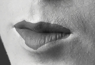
I decided that I would change the colour of the lips, so that the model looked almost as though she had a dark lipstick on in the actual photoshoot. Initially, this colouring had a harsh outline, looking as though I had poorly drawn the colour on:
As you can see this looks un-professional and I was not happy with this. I also decided that I would try to make the lips have a greater emphasis, therefore I would increase their size and colour with greater detail.
Using the smudge tool, I managed to colour the lips with far greater acuracy, whilst increasing the size of the lips to create that sense of prominence, without their size becoming distracting from the main image thanks to the 'blurry' quality.


No comments:
Post a Comment